Excel World Championship Sample Case #1: Knowledge Is Power

Table of Contents
Anybody who’s anybody has heard of the hot new sport sweeping the world: competitive Excel! Every year, dozens of the best analysts, accountants, and mathematicians face off to see who can best model extremely complicated problems within thirty minutes. The “sport” first gained widespread attention during the Covid-19 lockdowns and has been growing in popularity ever since; next week’s championship will take place in HyperX Arena in Las Vegas and be televised in bars on the other side of the country.
If this is the first time you’re hearing about all this, take a moment to check out People Make Games’s short documentary on the topic:
Personally, I don’t think my prowess at Excel quite reaches the levels of storied champions like Diarmuid Early or Laurence Lau (yet…). However, it came to my attention that the website for the Financial Modeling World Cup offers free sample cases adapted from actual tournament matches from previous years. With just a few minor tweaks, these would work perfectly as projects for my data analytics portfolio.
In this and future installments, I will use these sample cases as a jumping off point. Since I’m not doing these in a competitive context, I’m dispensing with the thirty-minute time limit and the graded questionaire. Instead, I will take the results and visualize them for the sake of the imagined stakeholders. Along the way, I will describe my process and the challenges I faced.
Scenario: Knowledge is Power #
This sample case (entitled “Knowledge Is Power” on the download page) tasks us with modeling future revenue for an online education company named Oxbridge Inc, which currently operates in the United States and Australia. They’ve become very successful during the pandemic, and they’re now planning to pitch to potential investors to fund their expansion.
Provided with the pricing and membership for five different programs (Dot, Line, Triangle, Square, and Star) along with projected monthly rates of membership growth and inflation, we have to model the next five years of monthly revenue starting in January 2022. This would be relatively simple if it weren’t for the following complications:
- All numbers must be reported in US dollars, so Australian revenue needs to be converted after applying its own specific inflation rate.
- Membership prices for each class need to keep pace with inflation and must rise in $5 increments.
- Prices can’t change too quickly. Oxbridge has recently instituted a policy of not changing any prices until at least three classes in the same country are closer to the next $5-increment than the current price. For example, a membership that currently costs $24.99 won’t jump to $29.99 until it’s actual inflation-adjust price is at least $27.49 and there are at least two other membership types that also qualify.
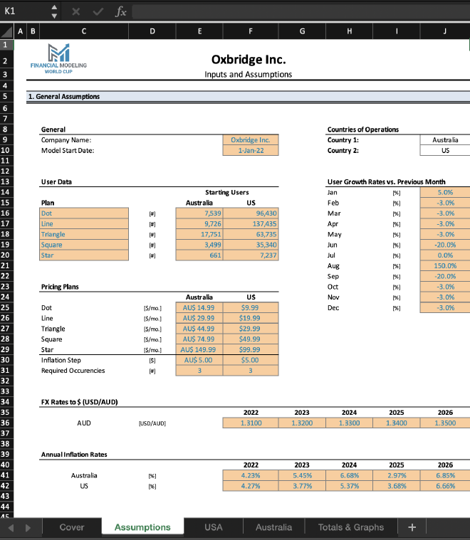
This case looks like it will require conditionals based on other conditions, so we have our work cut out for us. Let’s first start with the number for the USA.
USA #
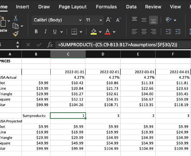
First, we’ll need to plot out all the dates and their corresponding inflation rates. Each inflation rate is assumed to hold for the entire year, so we need to make sure that the rate switches over every January. From there, it’s simply a matter of adding the monthly interest for each class:
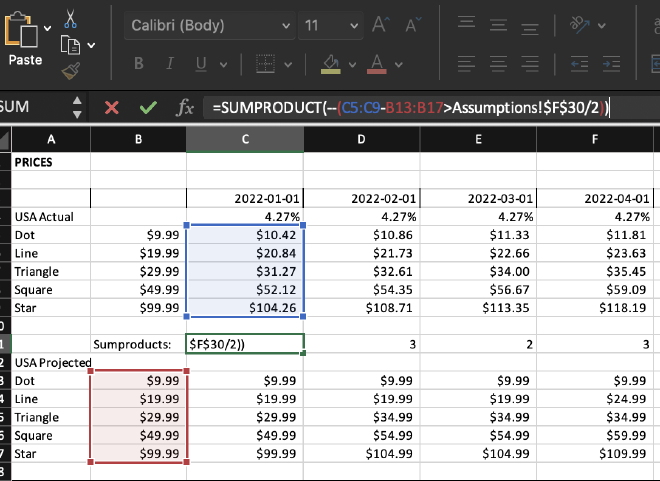
So how do we trigger the actual price increases below? This is where the SUMPRODUCT function comes in. With this formula, we can count the number of times where values in the range surpass the halfway threshold for the next $5-increment:
Now it’s the moment of truth: we need a conditional function predicated on both the difference in prices and the number of classes that month to meet that threshold. Obviously we’re going to us the IF function, but more importantly, we’ll need to use the AND operator to fit both conditions:
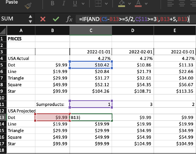
As a side note, I found it interesting that Excel’s AND is a function, as opposed to a mere operator like in Python or R. This makes it slightly weird to read since AND doesn’t come between the two conditions.
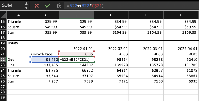
We can then work on membership numbers and their monthly growth rate. We set up the months and growth rate much in the same way as we did for the prices above, then plug in the starting numbers and iterate the monthly formula for each class:
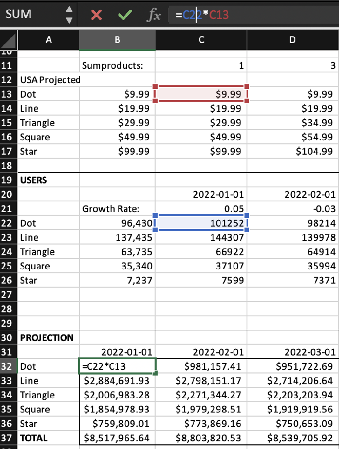
Now it’s just a matter of multiplying each class’s monthly cost by its monthly users:
Australia #
The sheet for the Australian branch follows a similar pattern as the sheet for the USA:
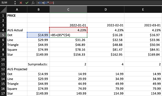
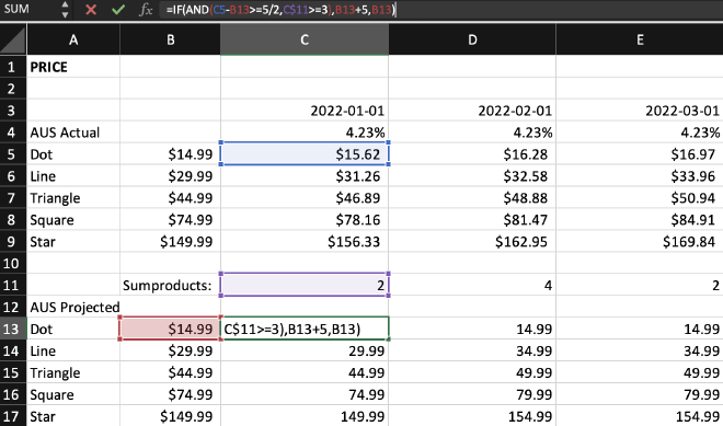
The major difference is that all prices are in Australian dollars, so I need to convert these into US currency using the provided conversion rates:
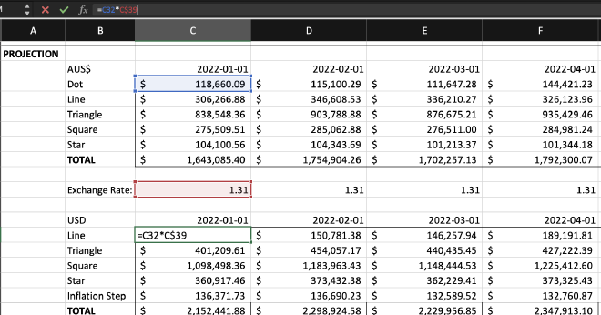
Just like the inflation rate, the conversion rate is assumed to remain the same for each year. We need to double check that the number changes beginning with each January.
Visualization and Analysis #
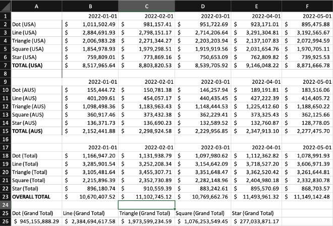
Now it’s time to import the resulting revenue into the next sheet and add the revenue for both branches together:
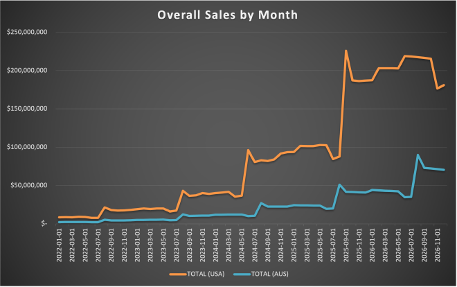
We can use Excel’s charts to prepare a presentation for potential stockholders. These line charts describe the projected overall revenue as well as the revenue for each branch:
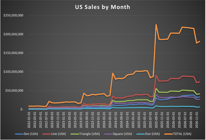
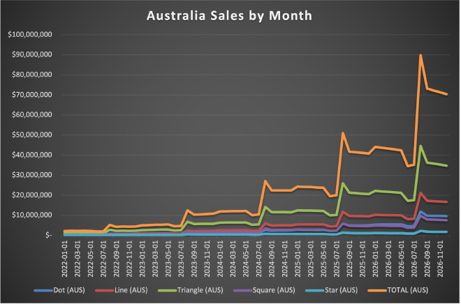
I’ve elected to include revenue for each class since it might help stakeholders strategize and make informed marketing decsions. Pie charts are often discouraged these days because they can sometimes be poorly designed, but in this case, I thought one might be helpful in visualizing how much each type of class contributes to revenue:
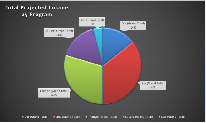
I’d say these projections are very reliable in the first couple years, but caution making any decisions based on the fourth and fifth years. We’re working with starting assumptions here, not data, so the numbers become less credible the further we move away from the starting state. For example, starting in 2024, the prices rise every month in at least four classes, ultimately defeating the intent of the company’s policy not to raise prices too frequently. It also beggars belief that the US branch will more than double it’s revenue to $225 million dollars starting in September 2025. If this were a real-life business situation, I would try to find a public or internal dataset to temper these projections or at the very least double-check the starting assumptions provided.
Conclusion #
This was a fun exercise and I’m looking forward to the next one. Some final thoughts on the process:
- At a certain point, I wondered if it would have been better to have chosen a long format over the wide format (i.e. long columns vs. long rows). In the next project, I’ll try to work with both simultaneously so I don’t paint myself into a corner.
- Excel is a powerful application, but Google Sheets rates higher in my book in terms of its usability. For example, I’ve never had problem making pivot tables in the latter, but for some reason, Excel is super fussy about it and won’t even let you begin one until every single thing is in the exact right place.
- I surprised myself with how much I missed creating charts using Python libraries like matplotlib and Seaborn. Sure, the process can be tedious at times, but at least every single element is theoretically customizable. Excel’s charts have a large array of options, but they’re split across several menus and sub-menus and sub-menus of sub-menus. If I can’t find the option I’m looking for, I can never be sure if it’s because it simply doesn’t exist or I haven’t plunged into the menus deeply enough. In short, the general release of Python for Excel can’t come soon enough!
If you’d like to download my Excel workbook and double check my work, click here! Feel free to message me on LinkedIn if you have any questions or suggestions.