UK Trains

It’s no secret that trains are my favorite form of transit. No traffic, no stress, just the forests and mountains and lakes passing by. You can read or write or talk to the strangers next to you. You can knit or play video games or just contemplate the landscape in silence. Even on the worst train rides I’ve ever been on, I could always comfort myself with the following mantra: “Well, at least I’m not driving.”
What a better project to express that affinity than Maven’s recent Rail Challenge, in which we’re tasked with exploring a dataset from the UK rail system and answering questions about it. In addition to exploring the data with Excel and Python, I will also visualize the data with Power BI. Unfortunately, Power BI doesn’t have a native application for MacOS, so I had to make due with the less-featured browser application. Despite that handicap, I found myself enjoying it quite a bit; it’s more straightforward and intuitive than Tableau, and the lower price point doesn’t hurt either.
I also wanted to flex my design muscles by trying to adhere The Economist’s design guidelines. I’ve been a long time fan of the magazine and its approach to data journalism, so it was a natural choice to take them as my inspiration. Given the limitations of the browser application, I feel like I did a good job in adhering to the guidelines.
If you’d like to just cut to the chase, look no further the Power BI presentation embedded below. Scroll further if you’d like to learn more about the data itself and how I processed and explored it.
Research Questions #
The challenge sets for the following tasks:
- Identify the most popular routes
- Determine peak travel times
- Analyze revenue from different ticket types & classes
- Diagnose on-time performance and contributing factors
Data Dictionary #
The dataset is described as follows:
Mock train ticket data for National Rail in the UK, from Jan to Apr 2024, including details on the type of ticket, the date & time for each journey, the departure & arrival stations, the ticket price, and more.
The bulk of the data consists of one CSV file with the following columns:
- Transaction ID - Unique identifier for an individual train ticket purchase
- Date of Purchase - Date the ticket was purchased
- Time of Purchase - Time the ticket was purchased
- Purchase Type - Whether the ticket was purchased online or directly at a train station
- Payment Method - Payment method used to purchase the ticket (Contactles Credit Card or Debit Card)
- Railcard - Whether the passenger is a National Railcard holder (Adult Senior or Disabled) or not (None). Railcard holders get 1/3 off their ticket purchases.
- Ticket Class - Seat class for the ticket (Standard or First)
- Ticket Type - When you bought or can use the ticket. Advance tickets are 1/2 off and must be purchased at least a day prior to departure. Off-Peak tickets are 1/4 off and must be used outside of peak hours - (weekdays between 6-8am and 4-6pm). Anytime tickets are full price and can be bought and used at any time during the day.
- Price - Final cost of the ticket
- Departure Station - Station to board the train
- Arrival Destination - Station to exit the train
- Date of Journey - Date the train departed
- Departure Time - Time the train departed
- Arrival Time - Time the train was scheduled to arrive at its destination (can be on the day after departure)
- Actual Arrival Time - Time the train arrived at its destination (can be on the day after departure)
- Journey Status - Whether the train was on time delayed or cancelled
- Reason for Delay - Reason for the delay or cancellation
- Refund Request - Whether the passenger requested a refund after a delay or cancellation
Preparing the Data #
# import packages and set up graph style

import pandas as pd
import numpy as np
import matplotlib.pyplot as plt
from datetime import timedelta

plt.style.use('fivethirtyeight')
# import data

df = pd.read_csv("railway.csv")
df.info()
<class 'pandas.core.frame.DataFrame'>
RangeIndex: 31653 entries, 0 to 31652
Data columns (total 18 columns):
# Column Non-Null Count Dtype
--- ------ -------------- -----
0 Transaction ID 31653 non-null object
1 Date of Purchase 31653 non-null object
2 Time of Purchase 31653 non-null object
3 Purchase Type 31653 non-null object
4 Payment Method 31653 non-null object
5 Railcard 10735 non-null object
6 Ticket Class 31653 non-null object
7 Ticket Type 31653 non-null object
8 Price 31653 non-null int64
9 Departure Station 31653 non-null object
10 Arrival Destination 31653 non-null object
11 Date of Journey 31653 non-null object
12 Departure Time 31653 non-null object
13 Arrival Time 31653 non-null object
14 Actual Arrival Time 29773 non-null object
15 Journey Status 31653 non-null object
16 Reason for Delay 4172 non-null object
17 Refund Request 31653 non-null object
dtypes: int64(1), object(17)
memory usage: 4.3+ MB
Identify the most popular routes #
First, I combine the names of each trip’s origin and destination to create the route name for each trip:
df['route'] = df['Departure Station'] + [' - '] + df['Arrival Destination']

# print the top ten most common routes
df['route'].value_counts().head(10)
route

Manchester Piccadilly - Liverpool Lime Street 4628

London Euston - Birmingham New Street 4209

London Kings Cross - York 3922

London Paddington - Reading 3873

London St Pancras - Birmingham New Street 3471

Liverpool Lime Street - Manchester Piccadilly 3002

Liverpool Lime Street - London Euston 1097

London Euston - Manchester Piccadilly 712

Birmingham New Street - London St Pancras 702

London Paddington - Oxford 485

Name: count, dtype: int64
Determine peak travel times #
I created a datetime object for both the departure and arrival of each trip:
df['departure_datetime'] = df['Date of Journey'] + ' ' + df['Departure Time']

df['arrival_datetime'] = df['Date of Journey'] + ' ' + df['Arrival Time']


## Change datatype to datetime

df['departure_datetime'] = pd.to_datetime(df['departure_datetime'])

df['arrival_datetime'] = pd.to_datetime(df['arrival_datetime'])

df.info()
<class 'pandas.core.frame.DataFrame'>

RangeIndex: 31653 entries, 0 to 31652

Data columns (total 21 columns):

# Column Non-Null Count Dtype

--- ------ -------------- -----

0 Transaction ID 31653 non-null object

1 Date of Purchase 31653 non-null object

2 Time of Purchase 31653 non-null object

3 Purchase Type 31653 non-null object

4 Payment Method 31653 non-null object

5 Railcard 10735 non-null object

6 Ticket Class 31653 non-null object

7 Ticket Type 31653 non-null object

8 Price 31653 non-null int64

9 Departure Station 31653 non-null object

10 Arrival Destination 31653 non-null object

11 Date of Journey 31653 non-null object

12 Departure Time 31653 non-null object

13 Arrival Time 31653 non-null object

14 Actual Arrival Time 29773 non-null object

15 Journey Status 31653 non-null object

16 Reason for Delay 4172 non-null object

17 Refund Request 31653 non-null object

18 route 31653 non-null object

19 departure_datetime 31653 non-null datetime64[ns]

20 arrival_datetime 31653 non-null datetime64[ns]

dtypes: datetime64[ns](2), int64(1), object(18)

memory usage: 5.1+ MB
Then I created another datetime object for the hour of each departure and arrival:
df['departure_hour'] = df['departure_datetime'].dt.hour

df['arrival_hour'] = df['arrival_datetime'].dt.hour
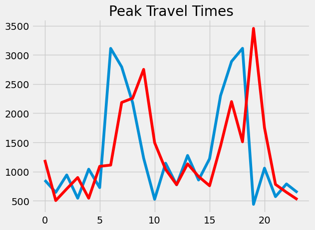
Then I plotted the arrivals and departures to demonstrate the peak hours of travel:
x1 = np.array(df['departure_hour'])

x, y = np.unique(x1, return_counts=True)

plt.plot(x, y)

plt.title('Peak Travel Times')

x2 = np.array(df['arrival_hour'])

x, y = np.unique(x2, return_counts=True)

plt.plot(x, y, color='red')

plt.show()
Analyze revenue from different ticket types & classes #
Counting the different kinds of ticket classes and types:
df['Ticket Class'].value_counts()
Ticket Class

Standard 28595

First Class 3058

Name: count, dtype: int64
df['Ticket Type'].value_counts()
Ticket Type

Advance 17561

Off-Peak 8752

Anytime 5340

Name: count, dtype: int64
I then created a pivot table adding up the revenue for each combination of ticket class and ticket type:
pivot_revenue = df.pivot_table(columns='Ticket Type', index='Ticket Class', values='Price', aggfunc='sum')

pivot_revenue
Ticket Type Advance Anytime Off-Peak

Ticket Class

First Class 66886 37841 44672

Standard 242388 171468 178666
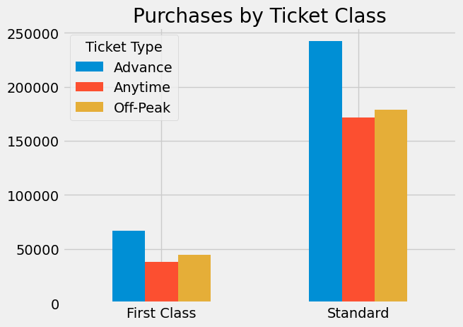
Plotting out revenue by ticket class, subdivided by ticket type:
plt.style.use('fivethirtyeight')

pivot_revenue.plot(kind='bar', xlabel='', title="Purchases by Ticket Class")

plt.xticks(rotation = 0)

plt.show()
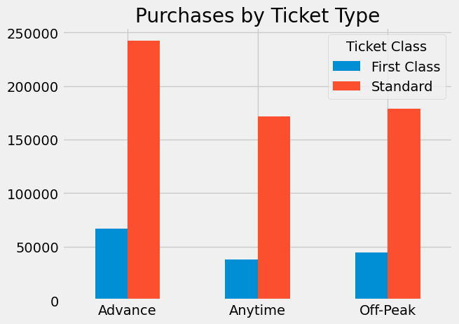
This pivot table is similar, except it aggregates revenue by ticket type before subdividing it into ticket class:
pivot_revenue1 = df.pivot_table(columns='Ticket Class', index='Ticket Type', values='Price', aggfunc='sum')

pivot_revenue1
Ticket Class First Class Standard

Ticket Type

Advance 66886 242388

Anytime 37841 171468

Off-Peak 44672 178666
Plotting out revenue first by ticket type, then by class:
plt.style.use('fivethirtyeight')

pivot_revenue1.plot(kind='bar', xlabel='', title="Purchases by Ticket Type")

plt.xticks(rotation = 0)

plt.show()
Diagnose on-time performance and contributing factors #
First, we need to determine by how many minutes each trip was late:
# Create Actual arrival date time

df['actualArrival_datetime'] = df['Date of Journey'] + ' ' + df['Actual Arrival Time']

df['actualArrival_datetime'] = pd.to_datetime(df['actualArrival_datetime'])

# Subtract arrival time from actual arrival time

df['delay'] = df['actualArrival_datetime'] - df['arrival_datetime']

df['delayMinutes'] = df['delay'] / timedelta(minutes=1)

df['delayMinutes'].head()
0 0.0

1 5.0

2 0.0

3 0.0

4 0.0

Name: delayMinutes, dtype: float64
# show most common delay times

df['delayMinutes'].value_counts().sort_index()
delayMinutes

0.0 27499

1.0 22

2.0 31

3.0 22

4.0 23

...

176.0 4

177.0 2

178.0 2

179.0 5

180.0 2

Name: count, Length: 133, dtype: int64
Let’s plot how the frequency of each delay length:
# drop all records without delays and plot most common delay times

df['delayMinutes'].value_counts().drop(0.0).sort_index().plot()

plt.show()
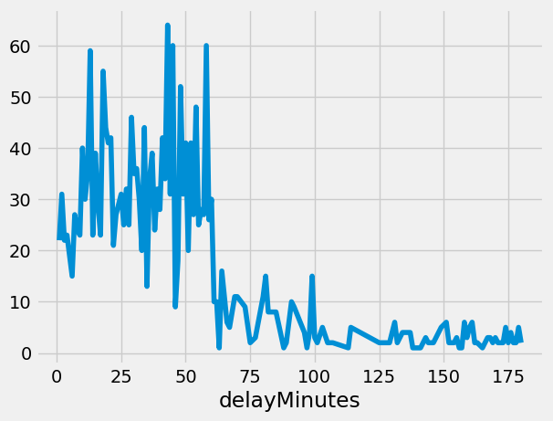
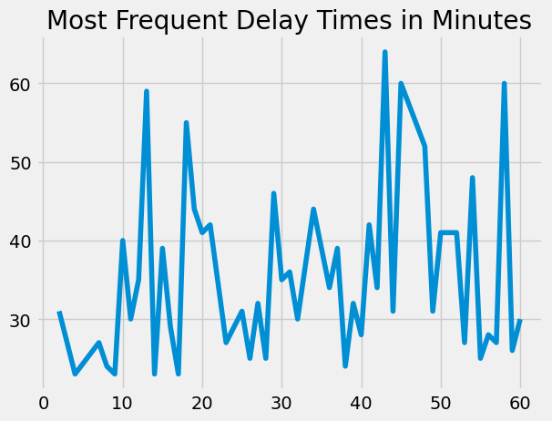
Most delays are less than than an hour long, so let’s zoom in on those:
# Only show top 50 most common delay times

df['delayMinutes'].value_counts().drop(0.0).head(50).sort_index().plot(title="Most Frequent Delay Times in Minutes", xlabel='')

plt.show()
# show most common reason for delay

df['Reason for Delay'].value_counts().sort_values(ascending=False)
Reason for Delay

Weather 995

Technical Issue 707

Signal Failure 523

Signal failure 447

Staffing 410

Staff Shortage 399

Weather Conditions 377

Traffic 314

Name: count, dtype: int64
Let’s turn that into a nice graph:
df['Reason for Delay'].value_counts().sort_values().plot(kind='barh', title='Most Common Reason for Delay', ylabel='')

plt.show()
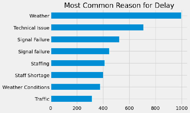
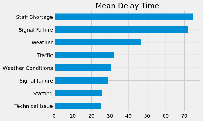
Of course, knowing the most common reasons for delay doesn’t necessarily tell us which reason causes the greatest amount of delay. To show that, we’ll create pivot table giving the mean delay time for each reason:
delay_pivot = df.pivot_table(index='Reason for Delay', values='delayMinutes', aggfunc='mean')

delay_pivot.sort_values(by='delayMinutes', ascending=False)
delayMinutes

Reason for Delay

Staff Shortage 74.934426

Signal Failure 71.681818

Weather 46.807388

Traffic 32.344828

Weather Conditions 30.544379

Signal failure 28.803828

Staffing 25.906977

Technical Issue 24.917373
Let’s turn that into a nice bar graph:
delay_pivot.sort_values(by='delayMinutes', ascending=True).plot(kind='barh', title='Mean Delay Time', ylabel='',legend=False)

plt.show()
